By Nexus Technology
03/08/2022
The human brain isn’t designed for quickly translating or digesting written information. Research from MIT (Source: MIT) shows quite the opposite, over 90% of the information that is transferred to the brain is in a visual format, and the human brain is configured to process these images in just 13 milliseconds. When compared to text processing, a University of Minnesota study shows that the human brain processes visuals 60,000 times faster than text (Source: University of Minnesota).
When we consider the above statistics, coupled with the fact that we’re generating more data than ever before, finding ways to make sense of these zero and one’s clearly doesn’t come naturally to us. To bridge the gap that exists between the human brain and big data, we need to look toward data visualisation…
What is data visualisation?
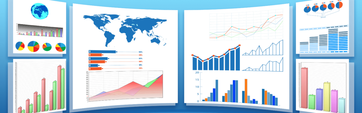
Data visualisation takes raw data and transforms it into a graphical representation – an example would be taking numbers from an Excel spreadsheet and outputting as a pie chart. This process helps humans to understand the results, trends, and outcomes from the data.
Now that pie chart in Excel is technically a data visualisation, but technology has evolved much more to include the integration of multiple data sets, and data sources, which allows for the intuitive and logical interpretation of data.
New tools supported by web hosting services allow businesses to showcase their visualisations internally by embedding them in presentations, business dashboards or intranets, and even in real-time on websites.
What can data visualisation offer my business?
Why should we apply data visualisation techniques within our business? Simply because all businesses can benefit from making data easier to comprehend, helping users to make informed data decisions quickly and effectively.
Benefits include:
Better data analysis – Help stakeholders quickly analyse huge amounts of data by turning raw data into visual diagrams that are easily understood by the user, allowing for attention to be directed to critical areas of the business, increasing efficiency and productivity.
Faster data interpretation – We have heard how the human brain interprets data visualisations much faster than text. Visualising data also allows for key stakeholders to quickly act on new data insights in real-time, which is necessary to remain competitive and grow the business.
Identify patterns within data – When we work with large amounts of complex data, it gives us a huge opportunity to gain valuable insights. Visualisation allows users to gain greater meaning by recognising patterns, trends, and relationships. Diving deeply into this data allows us to identify areas that can drive the business forward.
Find errors within data – Data visualisation helps identify errors. If the data moves users towards the wrong actions, then visualisations can help identify this sooner and be highlighted or removed.
Discover the latest trends – Data visualisation helps uncover the latest trends, allowing businesses to adapt to market needs and stay on top of problems as they arise. When businesses are on top of trends, it gives them the best chance of increasing profit and releasing quality products and services.
Tell a meaningful story – The main purpose of a visualisation dashboard is to tell a story. When you design visuals in a meaningful way, you provide your audience the best chance for understanding the message, in just one glance.
Create superior products and services – It is crucial for businesses that work in highly competitive markets to develop better products and services to remain in business. Take the retail and entertainment markets as an example, their success comes down to how quickly they can respond to customer demands and emerging problems. Visualisation helps these industries translate data fast, helping to build first-class products and services.
What are the functions that visualisations are used to illustrate?
Data visualisation has moved on well beyond spreadsheet pie and bar charts, and the best tools include visualisations such as bubble clouds, box-and- whisker plots, cartograms, dot distribution maps, Gantt charts, heat maps, matrix, text tables treemaps and so much more. Users can choose the visualisation tool that they need based on the data and audience requirements. Visualisations provide six analytical functions:
• Change over time (Time Change)
• Look at the path from point to point (Flow)
• Look at patterns that relate to position and location of data (Spatial)
• Explore how much a part makes up another part (Part-to-Whole)
• Compare the correlation, magnitude, and rankings between different
configurations (Comparison)
• Outline the spread, shape, and centre of data (Distribution)
What are the use cases for data visualisation?
Accurate data is at the forefront of any business decision and is essential for businesses to have a clear understanding of the market that they operate in, as well as being able to service their clients and keep track of competitor activities. To gain insights into this data, visualising it is the best option to:
• Help stakeholders understand how the business data can drive business growth
• Handle complex and large amounts of data that can be visualised through diagrams and charts, revealing unseen patterns within data
• Visualise data to help decision-makers manage growth, and convert trends into effective business strategies
• Uncover previously unknown trends and errors from multiple data sources, helping key stakeholders compose data analytics report
How to start visualising data?
Many tools and techniques are available to businesses to create effective data visualisations. However, it is important that you and your data team understand the underlying principles before selecting the right tools for your business.
Nexus Technology can help small and medium-sized businesses to define a business intelligence strategy, and architect and implement all the infrastructure needed to turn data into powerful visualisation dashboards, helping empower decision-making and drive innovation.
Are you ready to start visualising your data?